Finally! My new Windows Phone 8 phone has arrived. And first things first: it’s yellow. I mean really yellow. Granted I did order it in yellow, but this is smack-in-your-face-safety-vest-neon-super-yellow. I don’t mind actually. As you may have guessed it is the Nokia Lumia 920, and in this geek review I will touch on the handset as well as the new operating system. The first part of the review will wind its way around, through, over and between some of the new bits in the operating system. Part 2 will fondle, caress and make out with the new superstar from Nokia.
[pullquote]My Partner’s 7-year old boy loves Kid’s Corner, as it makes him feel it is his part of the phone. Pretty good trade-off for not sending your boss fart emails.[/pullquote]
I have been a user of the Windows Phone eco system for the past two years and a bit, and in that light I will go over some of the improvement over the past system, that you might not be aware of or have noticed. As was the case with the release of WP7.5 (Mango) in September 2011, WP8 includes a swath of improvements to an already feature rich and mature operating system. Some features are very noticeable, such as the new start screen, and others are buried deep in the belly of the beast, and will probably not be noticed directly. I won’t touch on all the new features and changes, as I do want to do other things for the next week. Instead I will emphasise the areas I feel are important and makes the platform stand out.
When Microsoft announced and indeed launched the new Phone software, the focus was (understandably) on the immediate visual changes and improvements. So that is where I will start.
Start Screen
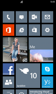
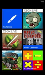
This is without comparison the most reviewed and featured part of the new Windows Phone operating system. It is the face of the new Microsoft Phone attack and the new start screen has been improved and made more “you” (customizable). The first iteration had live tiles showing your latest updates and content at a glance, but all you could do was to move the tiles around. There were some built in apps, like Calendar and Pictures, that were the size of two normal tiles, but that format was not available to third party apps. All that have changed, so app developers now have three formats to choose from.
The screen feels more alive, more personal and more usable. I especially like the smallest tiles for apps that don’t have text content to show on the tile. Something like Phone, Messages, Facebook and Email accounts only update the tile with a number. The small form factor is perfect for that. Other apps really shine from the large landscape tile, and make my Weather Channel app look very impressive. Once developers get their head around the tile sizes, they will become extremely useful and lets the user customise their phone until eternity.
Performance Improvements
A large part of the work on WP8 has gone into the support for all the new shiny hardware. There is now support for multicore processors, high definition screens, a brand new IE10 browser, memory expansions and much more. All of this performance shenanigans means that Windows Phone 8 is even more smooth and slick to use than Windows Phone 7 devices. All transitions, input screens, app loads and interaction in general is extremely responsive and there is no lag that I can find anywhere. It is like everything just works!
Apps load faster, due to the beefed up hardware, and some Apps now exhibit a much better resume behaviour than before. For example, the Facebook app now resumes to the screen you were on, instead of reloading the whole app. Apps stay in memory much much longer, so you don’t have to reload apps every 20 minutes. This means you can now switch between “My Little Pony” and “Rainbow and Butterflies” apps to your heart’s content, just like @alexmackey would do.
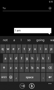
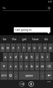
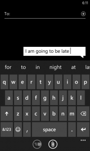
Another improvement I have noticed is that the keyboard is vastly improved on two fronts. For one the “Fat Finger” prediction seems more accurate in guessing which word you meant when you typed in “tebieq”. In fact it seems easier to hit the right letters on the keyboard. This might have something to do with the larger screen and the greater pixel density. However, much more exciting is the new predictive typing. In WP7 the keyboard would predict what word you were typing based on character placement and letter sequence, hence it could predict that when you wrote “Wed” you meant “Wednesday”. Not too difficult to implement, and all smartphone platforms has this feature. Now there is predictive sentences, which means WP8 will predict the next word before you have even typed it. For example I can type “I am going to be late” with only eight keystrokes. I haven’t been able to confirm it yet, but the type ahead feature supposedly learn from your typing as well. So it learns which words you put together, so over time it will be much more accurate and useful.
Speaking of the keyboard, Microsoft still haven’t sorted out a feature I loved on my iPhone, being multiple keyboard languages. On my iPhone back in the day, I could switch from English to Danish dictionary with one button click. That meant my text messages in Danish would have the correct spell checking. Still on WP8 I now either switch the language of the phone (not ideal and time consuming) or I teach the phone Danish. Every time a little squiggly red line come up I tap the word and add it to the dictionary. I feel a bit like a primary school teacher teaching the same naughty kid again and again.
Update: Last night I discovered you can download keyboards in a large number of languages, including Danish. Go to Settings -> Keyboard and you can add any of them. They are now available whenever the keyboard is visible, using a little button on the actual keyboard. Woohoo, another awesome addition and I was blaming the wrong kid again.
HD capability
Finally! Hooray, we now have beautiful high definition goodness on the screen. WP8 supports 720×1280 and 768×1280 pixels. On a 4.5 inch display that would mean somewhere in the vicinity of 332dpi. Ha, take that Apple retina display with your puny 326ppi. In other words, Microsoft is finally supporting industry standard screen resolutions.
It means you can record video in 720HD format, but more on the camera in Part 2.
Kid’s Corner
The most surprising, yet simple and useful, feature is Kid’s Corner. Swipe left on the lock screen and a second lock screen (if enabled) is shown.
This is the section where your kid can have their own section on their phone. This means no more access to your phone, no more sending emails to the Buddhist Society saying you want to join, and no more buying of magic unicorns on eBay while you weren’t paying attention. Your offspring can now have their own section they can customise with colours, resize icons and set their own lock screen image and text. As the owner of the phone (and by now probably several unicorns and pictures of cats wearing little Halloween costumes) you decide which apps are in the Kid’s Corner. My Partner’s 7-year old boy loves it, as it makes him feel it is his part of the phone. Pretty good trade-off for not sending your boss fart emails.
Internet Explorer
The browsing experience in WP8 still consists of only Internet Explorer (IE). We are now up to version 10, same as on Windows 8, and the engines behind both the mobile and the desktop browsers are the same. That means you get a faster, more standards compliant browsing experience, but I am still not convinced Microsoft has addressed all of the issues from previous versions. Granted, the browser is much quicker and there are some very nice features, such as customising the toolbar at the bottom and improved JavaScript rendering speed and HTML5 compliance.
I would like to see what Mozilla or Google could bring to the platform as well. If anything it would push Microsoft to improve IE to stay on top.
Enterprise Apps
The direction that Apple, Microsoft and to a lesser extent Google has taken with third party development, means that programs are certified by the corporation and published through the single channel. Back in the days of Wild West programming, every man and his dog (or duck even) could publish a program and sell and deploy it, on a platform like Windows Mobile. No problem. What that lead to, was a mess of different user interfaces, broken programs, general discontent and frustration. It did work occasionally, but there were a lot of problems. To fix this, the big corporations, starting with Apple, took control and dictated how applications and programs (or “apps”) were to look, feel and smell. Not only did the quality of apps improve, but it also proved to be a very generous income stream.
If you are in the development space, especially consulting, you might see a problem with this approach. Stores for purchasing apps are public. You publish one app, you can restrict by market or region, but essentially your grandma will have access to the new Magic Polar Bear Recognition app you made. Or even worse, an intranet application for a large corporation. There was no way to create private apps for a closed audience.
Apples approach was an Enterprise App Store, which allows companies to limit their attached handsets to a particular set of apps, be those public or not.
Microsoft is now introducing the Company Hub application which is similar to side loading apps in Windows 8, and without much of the hassle that was needed to accomplish the same in WP7. A Company Hub can be managed by the IT department in a company and allows full control and integration with Office and management via remote management features. If this is successfully implemented, it might just get Microsoft back in the door for mobility, with a lot of major corporations.
About time
A couple of little things have been annoying me by their pure absence. But lo and behold you can now take screenshots. Yes @sbarski, you can take a picture of your favourite cake recipe on the screen and email it, post it to Facebook or send it via MMS to your fan club. Press the Home button at the same time as the power button and Bob is your uncle (or you can get a picture of him at least).
I have also been trying to figure out why there was no pinching action on the camera when operating it. It seemed like such a natural thing to do, but Windows Phone was not having a bar of it. Until now.
Go Go Go
I love Windows Phone. Everyone around me will tell you I am a Microsoftee and I have seen several of my friends switch to Windows Phone and never look back. In my mind it is by far the best mobile platform when it comes to usability, personalisation, development experience and looks. There is nothing else like it.
My hope is that Microsoft Marketing can create a campaign that does the phone justice. A large problem I think is that retailers are not educated in showing off the devices, so people naturally gravitates to what their friends have. When it comes down to it, the general public don’t have an interest in which company creates their mobile experience. They buy the phone the guy next to them has. Unless someone can show them the different platforms and pros and cons of each, they aren’t going to change their ways.


