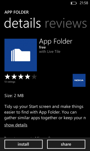
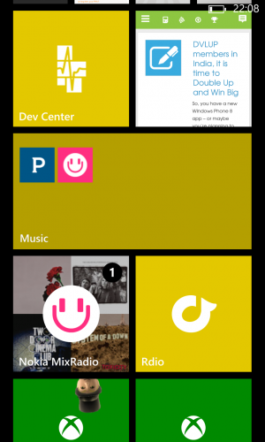
Today all the rage was about Nokia’s announcement about their App Folder app. This is essentially a way to group tiles into another tile and give it a title. Let us just establish that I am the biggest Nokia fanboy around, and I think the App Folder app not only is pointless, but it also encourages the wrong behaviour, which may damage the perception of the platform.
Apple and iOS, as well as Android, has had a similar feature for a long time, in act the first version was very similar to the App Folder app. This feature on iOS has now moved on and is must more polished. But it fits into a platform that is all about icons and more icons. They can be grouped.
On the Windows Platform it is a completely separate matter. The entire point, in my opinion, with the home screen is to be able for users to “glance and go”. I have said this over and over again, both in conversation and in my online courses: Live tiles on the Windows Phone platform is the single most effective way to engage your users and keep them returning to your app. If they don’t want to pin a tile to the home screen, then they use the list of apps. By allowing apps to be on the home screen, but not fully, and placing the app icons on a tile, the whole purpose of the home screen becomes polluted.
To me the appeal of the Windows Phone platform has always been that it was simple, intuitive (except for the back button) and predictable. Especially as a developer you can provide great value through a live tile by updating and customising them frequently. This is potentially lost now.
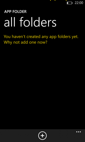
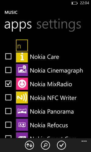
To comment briefly on the app itself, it is a very first attempt. It is not terribly intuitive, and it is really cumbersome to use. Because it is not part of the OS itself, you have to go into the app, then set up the tile, then pin it to the start screen. Unlike iOS you then can’t just tap to expand, but has to tap, tap, tap to get to the icons.
If you need the folders, then you are not understanding the thought behind the basic Windows Phone OS. Instead I would have loved to see a way to organise the long list of apps by for example category or by user choice. That would have been both useful and in line with the design of the platform.


