:::: MENU ::::
Posts tagged with: WP8

10 Reasons Why Windows Phone is Superior

Yesterday my best friend Alex received his Nokia Lumia 1020 after years of using iOS. He had had enough of the stale and uninspiring Apple framework, and decided to make the switch. Safe to say I didn’t stop him. I thought about why he changed and why others would make the switch, not just from iOS, but from other platforms as well. This list is highly subjective and is a view on what I think makes the platform stand out. It is a mix of features I like as a consumer, as well as a developer.  Feel free to agree, disagree and suggest other advantages in the comments below.

1 Nokia Lumia Devices

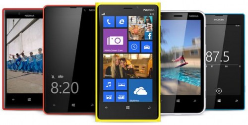
My absolute favourite physical thing about the Windows Phone universe are the devices from Nokia. The Lumia devices are extremely well built, they look amazing and they are pushing the boundaries all the time. There are a million reviews out there that you can read on each device, but my favourites at the moment are the Lumia 1020 and Lumia 1520.[pullquote]The Lumia devices are extremely well built, they look amazing and they are pushing the boundaries all the time.[/pullquote] The camera on the Lumia 1020 is without equal. Period. The 41MP camera with Pureview technology is so good, that I now rarely carry my great big Nokia DSLR with me. The digital zoom on the 1020 is so good, that you can now really do post image processing on your phone. When I have shown the camera and related apps on the phone, all but the most hardcore Apple fanboy is truly impressed. The Lumia 1520 is the latest 6 inch device, dubbed a “Phablet”. It is gorgeous. It is remarkably easy to hold in your hand, unless you are a hobbit, and the extra row of icons on the start screen is really useful. It has a whopping camera too, and 4 individual microphones for directional sound recording on video. I could go on and on about the Lumia devices (as friends and colleagues will testify to), but I’ll stop for now.

Courtesy of http://wmpoweruser.com/

Courtesy of http://wmpoweruser.com/

2 Eco System

One of the reasons I believe so much in the Windows Phone platform is because of the eco system. Microsoft is the only company that has managed to create a complete environment that caters for business, privates and consumers. Not only do they have Windows Phone for on the go, but Office 365 gives you Office on the go, SkyDrive gives you backup and universal access to files. Xbox is at home connecting your entertainment needs with all of the above and finally Windows gives you a fully featured operating system for all your tasks. You now use the same id across all these platforms and devices, and your apps and programs are starting to flow across as well. No other eco system can provide all of these with one experience. From a developer point of view, Windows Azure gives you the ability to provide this experience to your users by using cloud services to host information and provide value.

3 Start Screen

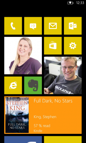
The first thing you see when you open up your Windows Phone is the start screen. This screen of square live tiles is the biggest advantage and differentiator of the operating system. The philosophy of “glance and go” makes so much sense in a day-to-day life where information is thrown at us all the time. Each individual app that the user chooses to pin to the start screen can be live and show a huge range of information. As a developer this is the most important thing I focus on and teach to other developers. If you can convince your users to pin your app to the start screen by providing value on the live tiles, they are much more likely to use your app regularly. The start screen is where users can customise the look and choose colours, tile sizes and make it a true representation of the kind of information that is important on a regular basis. It is a combination of apps that you want to keep close to open all the time, and apps that you mere glance at, such as the email, text messages, twitter and other frequently updated apps. The start screen experience is superior to any other platform and allows the user to be more efficient and not having to open an app to check a quick status.

Start Screen

4 Hub Integration

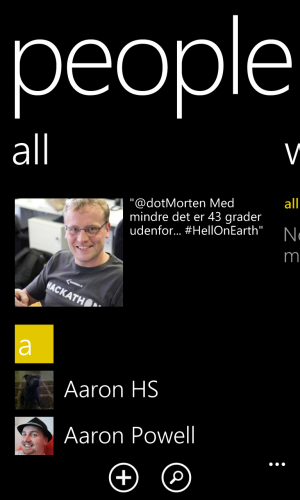
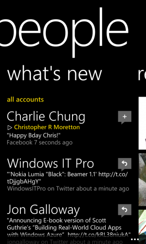
Windows Phone provides what is called “hubs”. These are essentially integration points, where various streams of information are collated and presented in a unified view. The People hub lets you see all contacts from your contact section of outlook.com, Facebook, Twitter and LinkedIn. The phone will automatically link contacts, so you have one page per contact, which shows all their details from the various services. From the contact page you can then directly phone, text, write on their Facebook wall, email them and so on. In addition you have a news feed that integrated news from all the various services in one location. No more opening one service at a time to check what is new. You get a similar experience with the photos hub, and there is also the games hub and more.

People Hub People Hub - News

5 Business Integration

Back in the good old days, Windows Mobile was the choice for enterprise users, as it neatly integrated with all of you corporate infrastructure. Blackberry came and stole some of that thunder, but now Windows Phone is supporting all of your business needs. There is full integration with user management, exchange and you can even set up a corporate Store to distribute internal apps for your own devices.

6 Driving Mode

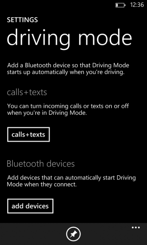
This was recently introduced in the GDR3 update, and gives you essentially safer driving. When set up, once your phone connects to a specific Bluetooth connection your phone is muted. This means that if you connect to the Bluetooth in your car, you will not be distracted by notifications, text messages and phone calls. You can alternatively choose to enable text messages and phone calls if you have the appropriate equipment to answer calls. You can even set up an automatic text message that is sent to mobiles calling you. For example if Alex called me, driving mode would reply in a text: “I am on the road at the moment, but will call you right back when I am free”. Really nifty. The driving mode is a simple idea, but really effective when staying safe on the road.

Driving Mode

7 Kids Corner

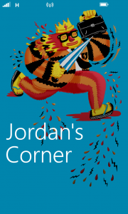
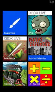
One of the features that makes my phone ownership experience all the better. If you have kids, you will know of the frustration when the littlies send your boss a fart email or buy those kitten themed chop sticks on eBay. In my case all the settings would be changed and the OS language would suddenly be Hungarian. I am sure you have heard of this happening if not to yourself. Kids Corner is a separate start screen experience aimed solely at kids. As the adult/administrator of the phone you choose which apps are available on Kids Corner, and any notifications are hidden so your part of the phone stays happy and intact. Kids can customise the screen as they want, and they often feel it is “their phone” when using it. This makes a great difference and I have no hesitation in handing over my device to the monkey (if he has deserved it). It still doesn’t prevent them though from running the battery flat in about 4 nanoseconds. That would be a nice setting to restrict access on battery levels. As a developer I haven’t found a true integration point to take advantage of Kids Corner. I have heard of users that use the feature to separate experiences for their own use and in essence have two start screens.

Kids Corner

8 Location Sharing

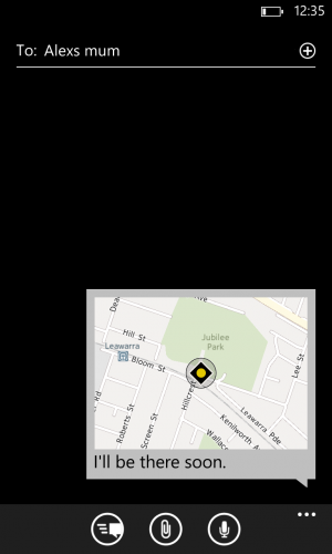
I am guessing this is one of those hidden features that gets overlooked. If you have ever been late and needed to tell how far you are away it used to be that you would find out where you were then make an educated guess and then text back to say how long you would be. Windows Phone has an integrated feature in the message app that lets you send your location as a map. It is a fully interactive map that you can send with a message. If the recipient has a Windows Phone device they will receive a fully interactive map too. If not, they get a link to one. This means you can now easily send location to contacts in whatever scenario it would help in. Easy to do and really useful.

Location Attachment

9 Groups

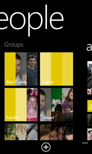
You can set up groups of contacts to easier find and communicate with a particular segment of your connections. You can set up a group for your sports team, user group, family or whatever makes sense. It is super simple to do as well. Just go to People Hub -> All -> New and add your contacts. You can then easily send group texts, emails or even chat. If you pin the group to the start screen as a live tile, you will also get updates only from that group. All in the spirit of “glance and go”. If you use the group feature on Facebook to group your friends, then Windows Phone will pick this up as well and use those.

Groups

10 Rooms

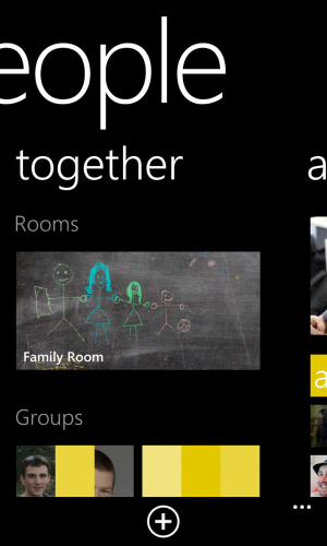
Rooms are private invitation only sections, where you can share photos, appointments and chat in a private setting. It does require all members to have a Windows Phone to get full functionality, but it works really well in a family scenario. You can share family photos, a calendar and even notes. Share the shopping list in a central location and all members can add to it. It is often not used to its fullest as most users don’t quite understand how it works.

Rooms

A Note

It is not really a point for the list, but I very often get the argument that “there isn’t enough apps”. For some reason the number of apps is a yard stick for many. Instead I would love it if people said “The new Kitten-in-bow-ties app is not available”. I can work with that and find an alternative. The fact is that the majority of apps are available on Windows Phone. In some cases they are called something different, such as 6Snap for Snapchat by Rudy Huyn.


DDD Brisbane 2013

On Saturday 7 December I presented at the developer conference DDD Brisbane on my favourite topic of Windows Phone. Despite some flight issues I managed to get to QUT and deliver my talk Building Your First Windows Phone App. The audience was very keen to learn about Windows Phone, and there was a lot of great questions and discussions during the 60 minute session. I managed to convince most that Windows Phone is the superior platform and best opportunity for developers (at least if you ask me). The attendee with the best and most thoughtful questions I decided to give a brand new Nokia Lumia 625 generously sponsored by Nokia Australia. I also gave out Nokia Luna headsets and trial subscriptions to Pluralsight, so people can go watch my online training courses on Windows Phone.

Me explaining how awesome Windows Phone is.

Me explaining how awesome Windows Phone is.

The conference also had a special guest speaker in Scott Hanselman, who talked about all the new amazing features in Visual Studio and what is to come in the near future. Scott also joined a panel of Joe Albahari from Linqpad, Joel Pobar from FaceBook and Hadi Hariri from JetBrains in a panel Q&A session, which was very interesting and very unscripted.

Me and Scott Hanselman

Me and Scott Hanselman

I hope to join everyone at DDD Brisbane again next year and if you want more photos check out Bronwyn’s blog post. Thanks also to my awesome employer Kiandra IT for getting me to Brisbane and supporting my efforts in Windows Phone world domination.


Nokia Future Capture Hackathon Apps Available Now

In late August I participated in the Nokia Future Capture Hackathon in Lund, Sweden with 9 other teams of developers. We had all been invited and flown to Sweden based on ideas submitted on how to utilise the Nokia Lumia 1020’s amazing 41MP camera. The aim of the hackathon was to develop a concept of the idea and then present it to the Nokia imaging team. It was an awesome event.

And now, a few months later the apps are starting to emerge in the Store. Below are the top 3 apps from the event, which are all now available in the store.

Smart Resize

The winning app is now available in the Store for free! The Smart Resize project lets you resize photos and the algorithm in the app magically knows what the boring bits are, so you don’t have to. It is a very clever idea and well executed. You can even outline areas that cannot be erased, areas that have to be erased and apply filters to the finished image.

Available here.

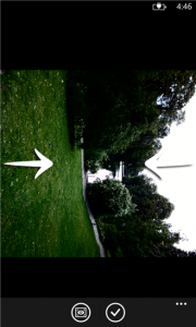
Smart Resize  Smart Resize

Social Scene

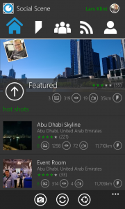
This is a big undertaking by Jason letting users capture images at all corners of the globe in a collaborative way. It was the runner up at the hackathon. Social Scene lets all users create time lapse videos by recording the exact position of each scene, guiding new users to the spot at any time to contribute to the experience. The app is very well presented and polished, and is frequently updated with new features. Give it a go and create your own Scene.

Available here.

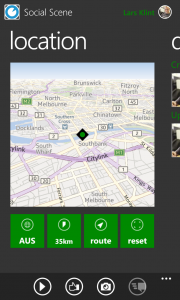
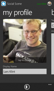
Social Scene Home  Social Scene Directions  Social Scene Profile

TapShoot

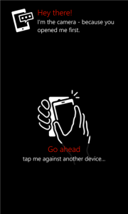
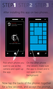
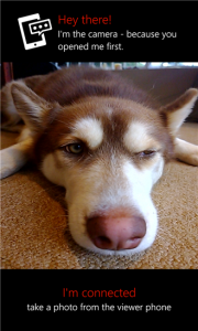
To address the issue of taking photos of yourself, Matt has built an app that lets you pair two phones and let one act as the viewfinder and the other as the camera. So you aim with one phone and can then see the image on the other phone so you can position yourself juuuuuust right. The idea doesn’t stop there though. Matt has built it in a way that you can control the camera from anything that uses his api, in fact Matt had the camera hooked up to a 200×200 pixel black and white smart watch. Very clever idea.

Available here.

Tap Shoot Guide  Tap Shoot Guide  Tap Shoot


First Pluralsight Course Published

This morning I published my first online video course with Pluralsight, titled Building Windows Phone Apps that Stand Out. It has been a long journey with an insane amount of hours spent writing, recording, editing and polishing everything off. It has given me an appreciation of how much work goes into producing high quality content for the World’s best hardcore developer training site, and I am immensely proud of the outcome.

Below is a small taste of my course, giving you the outline of the content. If you are a Windows Phone developer, this course will add that important knowledge gap of how you can make your app be awesome (and make you more money in the end).

So go ahead and check it out. You can get a free 30 day trial, so there really is no excuse to not start learning now.


Windows Phone 8: Show Me Your Live Tiles (Part 2)

The first part of my review had the focus set on the great software Microsoft has created for mobile, so in this second half my attention is on the hardware that arrived at my front door. My choice of handset is a bright, loud, solid, neon yellow Nokia Lumia 920. First impression is “come pick me up and touch my shiny screen”. At least most people I show it to, or see it on my desk, get that message loud and clear. Initial reaction from friends and colleagues is that it is a solidly built device. So why don’t we start with the physical forms of the phone. I won’t bore you with dimensions and other detailed technical specifications. Rather I will focus on the attributes that are the result of the factual data.

You can’t deny the yellow on my phone. When I ordered it I thought it would be more of a mustardy type yellow, but oh no. It is a loud, safety vest, almost toxic looking yellow. I like it. You can’t help but look at. The phone itself feels very durable, solid and well-built once you have it in your hand. Compared to other smartphones it does pack a whole lot of technology and most of it is best in class, so the slightly increased weight is to be expected. I have read some reviews that hammer the phone mainly based on the weight. In my experience you notice it the first dozen times you pick it up, then it becomes negligible.

Camera

The camera is awesome. That is my official technical verdict of the 8.7 megapixel Carl Zeiss lens with optical image stabilisation. Awesome.

Melbourne Big Wheel

Santa and his helper

(Yep, that is me and Santa).

Whatever witchcraft Nokia has packed into the camera, it works. The colours are vibrant and natural, the focus is sharp and the video now comes in HD. I take a lot of photos, but generally not with my phone. I lug around a Nikon DSLR, plus accessories, the size of Luxembourg, whenever I go somewhere where there is a potentially good photo opportunity. Now, I am not going to suggest that the Nokia camera comes up better than my trusty old Nikon, but I do think that it is on par with most compact digital cameras and better than a lot. This means I will use the Nokia as a “I’m just going on a short outing” camera, and keep the Nikon for longer trips, once off events etc. Yes, the camera on the Nikon really is that good.

Most phone cameras can take a decent still picture in sunlight or daytime, but night time or actions shots always come out looking like you were jumping on a trampoline and covering the lens in Vaseline. The Nokia has optical image stabilisation which means you can shake the camera and it still comes out sharp.  Night time uses more magic and fairy dust to set the ISO (light sensitivity) and remove the usual grainy look from your happy snaps.

The video function is equally impressive. Way less shaking than your normal YouTube style handheld videos, and it is just as vibrant and sharp (in HD too).

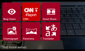
Oh, I almost forgot about the different lenses that you can download, use and abuse. When using the camera, different apps hook into the camera and you can choose a different lens, which means that app take over the camera. Allow me to demonstrate. You use the impressive Translator app from Microsoft to translate text on a page using the camera. Now you can launch the camera, then switch to the Translator lens, which will take you directly to the right spot in the app. It is a shortcut to the functionality within the app that uses the camera. Kind of neat, and does provide more deep integration between apps, which is what Windows Phone is all about.

Various Lenses

Sound

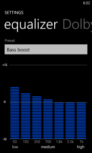
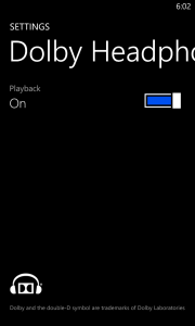
I listen to music from my phone all the time. On the train, working on projects, writing this post and even practising my river dance routines. I have invested in a decent pair of earphones from AudioFly and the Lumia 920 gives good output through the wires. I can fiddle with the equaliser settings and switch Dolby stereo sound on and off.

Equalizer Dolby Sounds Settings

The built in speakers are okay, but they are still teeny weeny and you can only expect so much from speakers made for the people of Whoville.

Battery

A bit of a boring subject, but just briefly: Bigger battery (2000 mAh) + bigger HD screen (4.5”) + more things to chew power = still not great battery performance. Oh, and you can’t remove it. So there.

Connectivity

It seems the good folks at Nokia made a checklist of every single mode of connectivity you can possible put in a phone. Short of having a mini Hadron Collider, this device has it all. Wifi in the b,g and n flavours, Bluetooth, NFC, Wireless charging using the QI standard, compatibility with 14 different network frequencies (2G, 2.5G, 3G, 4G) as well as the new Dual Core Snap Dragon processor. Not to mention the most sophisticated camera seen yet (yeah, I kind of like the camera).

But enough about all the delicious, crunchy hardware making up the Lumia 920. Let’s have a look at the software side of things. Nokia has produced a rather impressive suite of software for the Lumia range, in an aim to make their WP8 offering more attractive.

Nokia Maps

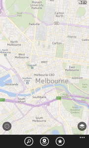
The Bing Maps app has been replaced by Nokia Maps, which to a large extent are better than the standard maps. The maps are very fluent and does provide useful information about local businesses, even though it is in no way up to par with Google’s localisation. However, the maps are very useful and seem 100 times more useful than Apples failed attempt at a mapping application (Apple does not acknowledge that Echuca in Victoria exists for example).

Nokia Maps

Nokia Drive

Nokia Drive is the Turn-By-Turn navigation. It does one thing, and one thing very well. It is a fully fledged GPS navigation app, which even has TTS (Text To Speech), which works. My car navigation TTS for some reason can’t pronounce “road”. It comes out as “rod” in this over the top American accent. You would have thought that is one word a GPS should get right, but I digress.

The application is free and comes with downloadable maps from all over the world. So not only can you always have up to date maps, but they are also stored offline, so you can always use your GPS (given it has any battery left, see above).

Nokia Music

Every single platform seems to have their own flavour of iTunes now. There are so many offerings out there you would be excused for not really caring. So what is different? iTunes has music purchases of every song on the planet almost, Xbox music has a monthly subscription, Google Music lets you upload your own catalogue of music to the Cloud and many many more.

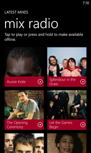
Nokia Music is in essence free listening. It comes with radio mixes, which lets you listen to everything from @alexjmackey’s favourite Genesis and Spandau Ballet to the current hits of local and international artists. Now, you can’t choose the exact songs to listen to, but you can select genres from Country and Western to Death Metal. And if there is a particular song or album you like, you have the option to buy it.

Nokia Music

Because all the music is streamed in the mixes, Nokia has been so kind as to let you download up to four mixes to your phone.

Now, all that is good, but you could ask why Nokia has even bothered to make their own music service? It is a massive undertaking and there are so many services out there as mentioned above.

And I have to mention that Nokia Music is quite buggy. The application decides to stop randomly, it has restarted my phone twice from crashing and even bricked my phone once to the point of a reset (hold down power button and volume down for about 10 seconds).

Nokia City Lens

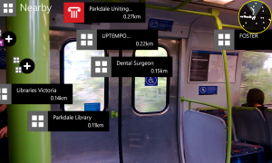
I first saw this idea in a French research project using Google information on an iPhone. The name of the project eludes me, but the idea of holding up your phone and it presenting an overlay of nearby attractions based on GPS coordinates and compass was mind blowing.

Well, Nokia City Lens is just that. Choose from eight different categories of places nearby, and the app will tell you what is nearby in this category. It works quite well, but the compass seems to be a bit off sometimes. And Dental Surgery came up under “Fun”. Not sure if that is a particular Finnish version of “Fun”. To be honest I haven’t looked up “Fun” in the Finnish dictionary.

Nokia City Lens

Tapping any of the icons on the screen (which move about a bit due to calibration issues I am assuming), will take you to the location in Nokia Maps and you can get directions. Very impressive app, but to be honest, I am not sure how much I will use it.

Conclusion

I can only hope Microsoft gets traction with this latest iteration of their mobile platform. I truly believe it is a more user friendly and efficient platform than the competition. Taking the whole ecosystem into account with Surface devices, Windows 8 and Xbox, it all just works together. Traditionally Microsoft marketing has been very fragmented and seemingly random, so hopefully this time around it is more successful. As I said in Part 1, I have shown WP7 to two friends deciding on a new handset, and both chose it over iOS, Android and *cough* Blackberry. Not because I told them to or persuaded them, but because they tried them all and chose the best one.

I haven’t touched on other handsets, but all the new WP8 devices are amazing. I had a very hard time choosing, but the outstanding camera and the gorgeous screen on the Nokia made it for me. If you want choice and personalisation in handset and user experience, but without having to be a geek (like me), it is the superior platform. If you don’t want to be a sheep and follow the flock for no other reason than following them, try out a Windows Phone.

I am not looking back.


Windows Phone 8: Show Me Your Live Tiles (Part 1)

Finally! My new Windows Phone 8 phone has arrived. And first things first: it’s yellow. I mean really yellow. Granted I did order it in yellow, but this is smack-in-your-face-safety-vest-neon-super-yellow. I don’t mind actually. As you may have guessed it is the Nokia Lumia 920, and in this geek review I will touch on the handset as well as the new operating system. The first part of the review will wind its way around, through, over and between some of the new bits in the operating system. Part 2 will fondle, caress and make out with the new superstar from Nokia.

[pullquote]My Partner’s 7-year old boy loves Kid’s Corner, as it makes him feel it is his part of the phone. Pretty good trade-off for not sending your boss fart emails.[/pullquote]

I have been a user of the Windows Phone eco system for the past two years and a bit, and in that light I will go over some of the improvement over the past system, that you might not be aware of or have noticed. As was the case with the release of WP7.5 (Mango) in September 2011, WP8 includes a swath of improvements to an already feature rich and mature operating system. Some features are very noticeable, such as the new start screen, and others are buried deep in the belly of the beast, and will probably not be noticed directly. I won’t touch on all the new features and changes, as I do want to do other things for the next week. Instead I will emphasise the areas I feel are important and makes the platform stand out.

When Microsoft announced and indeed launched the new Phone software, the focus was (understandably) on the immediate visual changes and improvements. So that is where I will start.

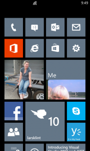
Start Screen

This is without comparison the most reviewed and featured part of the new Windows Phone operating system. It is the face of the new Microsoft Phone attack and the new start screen has been improved and made more “you” (customizable). The first iteration had live tiles showing your latest updates and content at a glance, but all you could do was to move the tiles around. There were some built in apps, like Calendar and Pictures, that were the size of two normal tiles, but that format was not available to third party apps. All that have changed, so app developers now have three formats to choose from.

Start Screen

The screen feels more alive, more personal and more usable. I especially like the smallest tiles for apps that don’t have text content to show on the tile. Something like Phone, Messages, Facebook and Email accounts only update the tile with a number. The small form factor is perfect for that. Other apps really shine from the large landscape tile, and make my Weather Channel app look very impressive. Once developers get their head around the tile sizes, they will become extremely useful and lets the user customise their phone until eternity.

Performance Improvements

A large part of the work on WP8 has gone into the support for all the new shiny hardware. There is now support for multicore processors, high definition screens, a brand new IE10 browser, memory expansions and much more. All of this performance shenanigans means that Windows Phone 8 is even more smooth and slick to use than Windows Phone 7 devices. All transitions, input screens, app loads and interaction in general is extremely responsive and there is no lag that I can find anywhere. It is like everything just works!

Apps load faster, due to the beefed up hardware, and some Apps now exhibit a much better resume behaviour than before. For example, the Facebook app now resumes to the screen you were on, instead of reloading the whole app. Apps stay in memory much much longer, so you don’t have to reload apps every 20 minutes. This means you can now switch between “My Little Pony” and “Rainbow and Butterflies” apps to your heart’s content, just like @alexmackey would do.

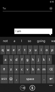
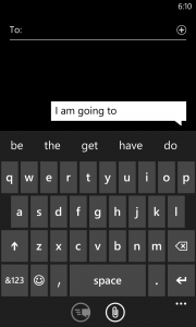
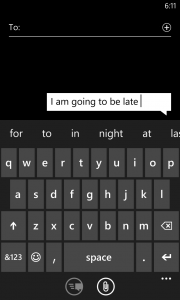
Another improvement I have noticed is that the keyboard is vastly improved on two fronts. For one the “Fat Finger” prediction seems more accurate in guessing which word you meant when you typed in “tebieq”. In fact it seems easier to hit the right letters on the keyboard. This might have something to do with the larger screen and the greater pixel density. However, much more exciting is the new predictive typing. In WP7 the keyboard would predict what word you were typing based on character placement and letter sequence, hence it could predict that when you wrote “Wed” you meant “Wednesday”. Not too difficult to implement, and all smartphone platforms has this feature. Now there is predictive sentences, which means WP8 will predict the next word before you have even typed it. For example I can type “I am going to be late” with only eight keystrokes. I haven’t been able to confirm it yet, but the type ahead feature supposedly learn from your typing as well. So it learns which words you put together, so over time it will be much more accurate and useful.

Predictive Text 1 Predictive Text 2 Predictive Text 3

Speaking of the keyboard, Microsoft still haven’t sorted out a feature I loved on my iPhone, being multiple keyboard languages. On my iPhone back in the day, I could switch from English to Danish dictionary with one button click. That meant my text messages in Danish would have the correct spell checking. Still on WP8 I now either switch the language of the phone (not ideal and time consuming) or I teach the phone Danish. Every time a little squiggly red line come up I tap the word and add it to the dictionary. I feel a bit like a primary school teacher teaching the same naughty kid again and again.

Update: Last night I discovered you can download keyboards in a large number of languages, including Danish. Go to Settings -> Keyboard and you can add any of them. They are now available whenever the keyboard is visible, using a little button on the actual keyboard. Woohoo, another awesome addition and I was blaming the wrong kid again.

HD capability

Finally! Hooray, we now have beautiful high definition goodness on the screen. WP8 supports 720×1280 and 768×1280 pixels. On a 4.5 inch display that would mean somewhere in the vicinity of 332dpi. Ha, take that Apple retina display with your puny 326ppi. In other words, Microsoft is finally supporting industry standard screen resolutions.

It means you can record video in 720HD format, but more on the camera in Part 2.

Kid’s Corner

The most surprising, yet simple and useful, feature is Kid’s Corner. Swipe left on the lock screen and a second lock screen (if enabled) is shown.

Kids Corner Lock Screen Kids Corner Home Screen

This is the section where your kid can have their own section on their phone. This means no more access to your phone, no more sending emails to the Buddhist Society saying you want to join, and no more buying of magic unicorns on eBay while you weren’t paying attention. Your offspring can now have their own section they can customise with colours, resize icons and set their own lock screen image and text. As the owner of the phone (and by now probably several unicorns and pictures of cats wearing little Halloween costumes) you decide which apps are in the Kid’s Corner. My Partner’s 7-year old boy loves it, as it makes him feel it is his part of the phone. Pretty good trade-off for not sending your boss fart emails.

Internet Explorer

The browsing experience in WP8 still consists of only Internet Explorer (IE). We are now up to version 10, same as on Windows 8, and the engines behind both the mobile and the desktop browsers are the same. That means you get a faster, more standards compliant browsing experience, but I am still not convinced Microsoft has addressed all of the issues from previous versions. Granted, the browser is much quicker and there are some very nice features, such as customising the toolbar at the bottom and improved JavaScript rendering speed and HTML5 compliance.

 IE 10

I would like to see what Mozilla or Google could bring to the platform as well. If anything it would push Microsoft to improve IE to stay on top.

Enterprise Apps

The direction that Apple, Microsoft and to a lesser extent Google has taken with third party development, means that programs are certified by the corporation and published through the single channel. Back in the days of Wild West programming, every man and his dog (or duck even) could publish a program and sell and deploy it, on a platform like Windows Mobile. No problem. What that lead to, was a mess of different user interfaces, broken programs, general discontent and frustration. It did work occasionally, but there were a lot of problems. To fix this, the big corporations, starting with Apple, took control and dictated how applications and programs (or “apps”) were to look, feel and smell. Not only did the quality of apps improve, but it also proved to be a very generous income stream.

If you are in the development space, especially consulting, you might see a problem with this approach. Stores for purchasing apps are public. You publish one app, you can restrict by market or region, but essentially your grandma will have access to the new Magic Polar Bear Recognition app you made. Or even worse, an intranet application for a large corporation. There was no way to create private apps for a closed audience.

Apples approach was an Enterprise App Store, which allows companies to limit their attached handsets to a particular set of apps, be those public or not.

Microsoft is now introducing the Company Hub application which is similar to side loading apps in Windows 8, and without much of the hassle that was needed to accomplish the same in WP7. A Company Hub can be managed by the IT department in a company and allows full control and integration with Office and management via remote management features. If this is successfully implemented, it might just get Microsoft back in the door for mobility, with a lot of major corporations.

About time

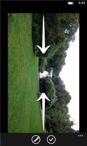
A couple of little things have been annoying me by their pure absence. But lo and behold you can now take screenshots. Yes @sbarski, you can take a picture of your favourite cake recipe on the screen and email it, post it to Facebook or send it via MMS to your fan club. Press the Home button at the same time as the power button and Bob is your uncle (or you can get a picture of him at least).

I have also been trying to figure out why there was no pinching action on the camera when operating it. It seemed like such a natural thing to do, but Windows Phone was not having a bar of it. Until now.

 Go Go Go

I love Windows Phone. Everyone around me will tell you I am a Microsoftee and I have seen several of my friends switch to Windows Phone and never look back. In my mind it is by far the best mobile platform when it comes to usability, personalisation, development experience and looks. There is nothing else like it.

My hope is that Microsoft Marketing can create a campaign that does the phone justice. A large problem I think is that retailers are not educated in showing off the devices, so people naturally gravitates to what their friends have. When it comes down to it, the general public don’t have an interest in which company creates their mobile experience. They buy the phone the guy next to them has. Unless someone can show them the different platforms and pros and cons of each, they aren’t going to change their ways.