:::: MENU ::::

Nokia Future Capture Hackathon Apps Available Now

In late August I participated in the Nokia Future Capture Hackathon in Lund, Sweden with 9 other teams of developers. We had all been invited and flown to Sweden based on ideas submitted on how to utilise the Nokia Lumia 1020’s amazing 41MP camera. The aim of the hackathon was to develop a concept of the idea and then present it to the Nokia imaging team. It was an awesome event.

And now, a few months later the apps are starting to emerge in the Store. Below are the top 3 apps from the event, which are all now available in the store.

Smart Resize

The winning app is now available in the Store for free! The Smart Resize project lets you resize photos and the algorithm in the app magically knows what the boring bits are, so you don’t have to. It is a very clever idea and well executed. You can even outline areas that cannot be erased, areas that have to be erased and apply filters to the finished image.

Available here.

Smart Resize  Smart Resize

Social Scene

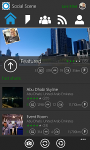
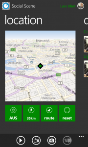
This is a big undertaking by Jason letting users capture images at all corners of the globe in a collaborative way. It was the runner up at the hackathon. Social Scene lets all users create time lapse videos by recording the exact position of each scene, guiding new users to the spot at any time to contribute to the experience. The app is very well presented and polished, and is frequently updated with new features. Give it a go and create your own Scene.

Available here.

Social Scene Home  Social Scene Directions  Social Scene Profile

TapShoot

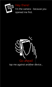
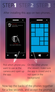
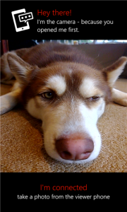
To address the issue of taking photos of yourself, Matt has built an app that lets you pair two phones and let one act as the viewfinder and the other as the camera. So you aim with one phone and can then see the image on the other phone so you can position yourself juuuuuust right. The idea doesn’t stop there though. Matt has built it in a way that you can control the camera from anything that uses his api, in fact Matt had the camera hooked up to a 200×200 pixel black and white smart watch. Very clever idea.

Available here.

Tap Shoot Guide  Tap Shoot Guide  Tap Shoot


First Pluralsight Course Published

This morning I published my first online video course with Pluralsight, titled Building Windows Phone Apps that Stand Out. It has been a long journey with an insane amount of hours spent writing, recording, editing and polishing everything off. It has given me an appreciation of how much work goes into producing high quality content for the World’s best hardcore developer training site, and I am immensely proud of the outcome.

Below is a small taste of my course, giving you the outline of the content. If you are a Windows Phone developer, this course will add that important knowledge gap of how you can make your app be awesome (and make you more money in the end).

So go ahead and check it out. You can get a free 30 day trial, so there really is no excuse to not start learning now.


A Guide to Choosing Native or Web for Mobile apps

As a consultant for one of Australia’s leading software development houses, I often come across the inevitable question from a client, when talking about mobile development: “should I have a native app for each platform I want to target, or should I just have one mobile web application”. Often the answer to that question is not that clear cut. In essence it depends on two factors, namely requirements and current technology.

You obviously always have to listen to the client’s needs and requirements, get to the core of the problem they are wanting to solve and provide a solution accordingly. With that in mind it becomes an exercise in fitting in to one or the other path to successful mobile app development. It is important to get this decision on native or web app right from the start, as it can be an expensive exercise to switch mid project. However, if you are prepared you can guide the client and inform them on the best choices they can make.

[pullquote]

In essence it depends on two factors, namely requirements and current technology.

[/pullquote]

On the other hand you have to stick to what the technology can provide you once you start developing the product. You can of course push the boundaries, which we like to do at Kiandra, but there will be some limitations in whichever technology you choose.

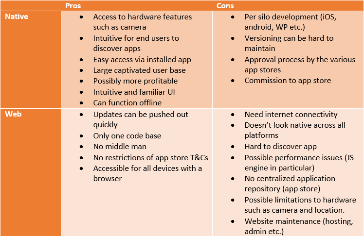
Because this question comes up regularly, I developed a matrix to help myself, and the clients, out in determining whether to go native or web. It goes a little somethin’ like this:


Pros and Cons of Native vs. Web App

Pros and Cons of Native vs. Web App

It is meant to be a quick guide to identifying the pros and cons of each approach and help you choose the appropriate one in a particular situation. You have to take into account factors such as requirements, time and flexibility, but in general it is a great starting point.

For both approaches there are people who are for and against, and it is important you choose the solution that will get the job done in the best possible way. Don’t just chose an approach because it is the most popular at that moment.

If you have any other points that I have missed or would fit into the matrix let me know in the comments below.

First published at blog.kiandra.com.au

Top 5 Web Developer Browser Tools

In a world which increasingly relies on the internet for pretty much everything from funny pictures of kittens to complex Super Annuation calculations (ask @alexjmackey about fun with those), the modest web browser is not so modest anymore. Gone are the days of cumbersome web apps with full page reloads and spinning gifs (and who could ever forget <blink>Awesome Sauce!</blink>). Today web applications has to work on desktop, tablet and mobile formats. They have to work across all modern browsers (and sometimes in some archaeological ones too), be lightweight, responsive and unit tested.

As a software developer you have to be aware of all these areas when you set out to build the next web app of the future. You will most likely have specifications to build after, but what tools can help you really excel in your build process? Below I have listed some of the tools which have helped me nail some issues, or made some tasks much much easier. Let me know in the comments, if you have other tools that are awesome/interesting.

User Agent Overrides

Because the web is now available via pretty much every device with a screen, as a developer you have to accommodate all these different resolutions. You have to make sure your latest post on Estonian knitting looks awesome on a PC, a MacBook air, an iPhone, Nokia’s Latest Windows Phone and many other devices. All of these devices have different user agents, which tell the browser which device it is. The browser and, more importantly, the requested web site can then change it behaviour accordingly.

In Google Chrome you can access the user agent overrides via the Dev tools settings. Hit F12 and go to settings in the lower right hand corner (little cog).

Dev Tools Settings

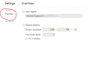
On the settings screen select “Overrides”

Override Settings

Here you can override the user agent and the screen size. This is really handy to simulate all your target devices, and it actually works!

Similar functionality is available in Firefox via a plugin, or in Internet Explorer via the developer tools as well (that is via F12 too).

IE Overrides

Page Speed

One of the key ingredients to a successful website is performance. As the below infographic from StrangeLoop indicates, just a 1 second delay in page load time can decrease customer satisfaction by 16% and almost half of visitors will not return to a poorly performing site. On top of that web users now expect the site to work equally fast on mobile devices. Major sites like Google and Yahoo records increase in traffic in the millions for just getting fractions of a second faster page loads. Yes, page load and performance are truly important on all platforms.

Strangeloop Infographics

Fear not, Page Speed to the rescue! This add on to your developer tools in Chrome made by Google (there is also a FireFox version) instantly gives you an insight into yours or anyone’s site performance.

PageSpeed Start

Once you click on the “Start Analysing” button, the site will reload and all manners of metrics will be recorded. The really cool thing is that you don’t just get a bunch of numbers for sections or areas. All of the data is presented as suggestions on what to improve and how to improve it. Very cool.

PageSpeed Analysis

You can immediately tackle the high priority items, and prioritise the rest.

WhatFont

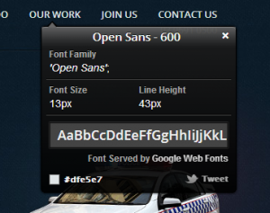
One of the pain points of developing smick looking web sites for your local Russian dance association is to deal with fonts. Fonts can be missing, they can be overridden they can be served from different sources. It all makes it complex to keep track of. WhatFont lets you inspect fonts on a page with ease.

WhatFont

Very simple, very easy to use. Makes the font task easy to handle.

Knockoutjs Context Debugger

There are a lot JavaScript frameworks around, and they can do vastly different things. There is the omnipresent jQuery, the pweetty and versatile three.js and the more interestingly named pyjamas and handlebars.

A framework I am starting to really get the hang of is Knockout. It is an MVVM framework, which makes all the JavaScript magic so much easier. Using a viewmodel, your front end code becomes very dynamic and updates through binding of properties. The problem with this is that all of the bound properties and code becomes hidden or obfuscated. Knockout Context Debugger to the rescue! This is a Chrome exclusive plugin that I was made aware of my @Nazulu.

Knockout Context Debugger

It installs as an extra section in your developer tools, which is accessible on the elements tabs. Select an element that has knockout binding to it, and watch the magic JS fairies populate your knockout context section. It is extremely valuable if you work with Knockout.

NHProf

Going hand in hand with performance of a web site is the server side response time. Often the backend of a website has some form of database interaction, whether you are storing recipes or the latest AFL results. If this database connection is slow, your site will be slow. A large majority of sites will be using an ORM to help interaction with the database. One of the more popular ORMs is NHibernate.

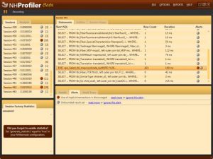
Although it is not a browser tool, I use NHProf every time I use the browser to optimise performance. NHProf is a profiling tool for the SQL executed on the database using NHibernate. Because NHibernate makes it difficult to see exactly what is being executed, optimising your NHibernate code is sometimes difficult. But with NHProf you can see exactly what was sent to the database and perform detailed analysis of the queries and results.

The licensing for NHProf is a bit on the expensive side, but the benefits are huge if you are serious about database performance.

NHProf


Top 5 Software Development & Software Management tools

Previously published at blog.kiandra.com.au

When it comes to tools for building software, there are about as many opinions as there are software developers (affectively known as code monkeys). Compiling a list of the top tools of any discipline within software building will be highly subjective. As such this list (well, there are actually two lists as you’ll find out) is a reflection of talking to a small sample of developers. These developers are all highly passionate about software and the creation of such, and all have their personal preferences. This article is not meant to tell you what you should use, but rather (hopefully) present new ideas and inspire you to try out alternatives. Take what you can use and leave the rest.

The first list of tools is leaning more towards the software crowd that has the business analyst or project management hat on. Having said that, all the tools in this list are very useful to developers as well. Chances are, if you are a disorganised developer your code will be disorganised as well. These tools could help organised your day, your project and your code.

Software Management

Any management of software building is complex. Acceptance criteria, customer expectations, development lifecycle, defects and unexpected events are all part of producing a successful outcome. For those task and more, below is a list of tools that can make your software management journey feel like a two week holiday in the <destination type=”dream”> Siberian Tundra.</destination>

Trello

Thought up by Joel Spolsky and his company Fog Creek Software, Trello facilitates easy collaboration between teams. Using a method known as Kanban, Trello has a series of boards which define various steps in a project. Boards contain Lists, which has a number of Cards on them. Cards, or tasks, are the basis for managing the finer grain of a project, and the cards are meant to move from list to list to monitor progress. Users are then associated with boards and can be assigned cards.

trello

The application of Trello is limited only by the imagination of the user. You have complete control of boards, lists, cards, who can see a board and who is doing what. You can attach photos, files and web links. You can tag and label cards for more categorisation and you can track changes to cards.

Top this off with a superb user interface that feels natural and straight forward. The learning curve is very mild.

JIRA

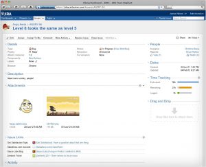
If you are working on projects that are just medium in size or are working in a medium sized organisation, chances are you have heard of JIRA. Built by Sydney based company Atlassian, JIRA is a one stop option for project tracking and task/issue management on any project. At the time of writing version 5 is the current iteration and offers the end user complete oversight of a particular task’s status, a project’s progress and everything in between.

jira

Just to test the flexibility (and because I am a developer, hence love cake) I once created a JIRA task for my business development manager to bake muffins. I tagged the task with the ingredients required, set the status to “blocker” and put a deadline on the task. The description allowed for some flexibility in the style of muffins and I even contemplated putting additional resources and cost estimates on the task too. The outcome was a healthy dozen muffins enriching my entire team’s day.

pm.stackexchange.com

Chances are that you have heard of stackoverflow.com, one of the largest technical forum sites on the interwebs. As part of the Stack Network there is pm.stackexchange.com, which is a portal for project managers in particular. Questions relating to project management are put forward, then answered and rated for relevance and quality, much like Stack Overflow.

pm.stackexchange

Podio

To organise team communication, business processes, data and content in project management workspaces, Podio supplies a web-based platform which is free to sign up to. You can also select business apps from an online app store or build your own as you see fit.

Being a relatively new service (started in 2011), Podio is very ambitious and does offer a great range of tools for managing leads, tracking job candidates, doing accounting and everything in between. It is a social take on project and team collaboration.

podio

As an aside, I don’t mind either that Podio is yet another quality software package to come out of Denmark. The motherland seem to have a lot of interesting products and ideas coming out in the last few years.

Zoho

The online office suite has been around for eons in web speak. Launched in 2005 Zoho offers a range of products including word processing, spreadsheets, presentations, wikis, bug tracker, chat, mail and much much more. They were one of the first to offer proper cloud office services, negating the need for software and hardware updates.

zoho

Software Development

The main mantra for a software developer is “why do something, someone else has already done (well)”. If there is a tool that makes your life as a developer more productive, makes you produce better software, allows you to refactor code easier, can massage your back while playing soft soothing music and feeding you snacks or whatever it might be, then we use it. There is always a better way of doing a particular task, and if someone offers you a shortcut to do that, then why try and invent the muffin tin yourself?

Cloud 9

If you are like me and always on the go, being in a car, commuting to work, at a client or spending time away from your normal work station in some fashion, then you will quite likely have come across the desire to have your work/pet project/library reading list app with you. Cloud 9 allows you to have a complete development environment within a browser. You can collaborate on projects with other likeminded developers and even edit in real time with another party. Pretty cool.

cloud9

The IDE in the cloud supports the most popular languages such as PHP, Javascript, SQL and XML. However, you also have support for the languages used less often such as Lua, Scala and SH. You get intellisense, code completion and integration with the most popular cloud services, such as Windows Azure, heroku and Cloud Foundry.

Live.js

Ever had to edit CSS or Javascript, then view it in the browser to see your change? The typical workflow is something like

  1. Load browser to see what is broken/needs fixing
  2. Open up the file to edit
  3. Save change
  4. Alt+Tab or click on browser window
  5. Hit F5
  6. Observe change

With Live.js you get to skip step 4 and 5. A small piece of JavaScript will automagically update your browser to always show the latest HTML, CSS and JavaScript. It is efficiency++.

BrowserStack

As a web developer testing your work in a plethora of different browsers is always arduous. Not only is it easy to skip over the browsers with little use, but even more importantly, where do you get access to IE version 6 or Firefox version 13. And not only that, but you have to test on Windows XP, Windows 7 and Mac OS Mountain Lion. Welcome to the party BrowserStack. These guys have made the effort of keeping around almost any modern(-ish) browser/platform combination you can think of.

BrowserStack1

BrowserStack2

It is a truly invaluable tool if you want to make sure you have all your bases covered. Every new browser and platform combo is spun up in a new Virtual Machine, so you have your own instance. You can set up a secure tunnel, so you can test your local html and design on the remote server.

ReSharper

It has almost become part of the default toolset for web developers working with the Microsoft stack to use ReSharper. A lot developers I talk to almost can’t use Microsoft Visual Studio now without this comprehensive productivity tool. Just to name a few features, ReSharper will give you real time code analysis, keep you compliant to agreed coding standards, search huge datasets and thousands of files instantly, code refactoring with ease, code cleanup, multiple refactoring tools and oh so much more.

ReSharper1

Chances are that your productivity as a developer will increase significantly, but that is not the best bit. ReSharper takes care of all the boring stuff, such as renaming “cat” to “kitten” in your Fantastic Feline application (@alexjmackey has written that one), so you won’t have to. The team at JetBrains has put a lot of effort into making sure you don’t do the boring repetitive tasks of old grey beard developer days.

ReSharper2


<tool>your favourite</tool>

As I said in the beginning, this list is highly subjective. This last item is your chance to let us know what your favourite tool is. Fill in the comment below and tells us your favourite tool and why you think it is valuable. It can be anything, as long as it doesn’t involve ducks. Ideally it should be something which improves the dramatically interesting live of developers.

Give it your best shot. I want to know!!


Windows Phone 8: Show Me Your Live Tiles (Part 2)

The first part of my review had the focus set on the great software Microsoft has created for mobile, so in this second half my attention is on the hardware that arrived at my front door. My choice of handset is a bright, loud, solid, neon yellow Nokia Lumia 920. First impression is “come pick me up and touch my shiny screen”. At least most people I show it to, or see it on my desk, get that message loud and clear. Initial reaction from friends and colleagues is that it is a solidly built device. So why don’t we start with the physical forms of the phone. I won’t bore you with dimensions and other detailed technical specifications. Rather I will focus on the attributes that are the result of the factual data.

You can’t deny the yellow on my phone. When I ordered it I thought it would be more of a mustardy type yellow, but oh no. It is a loud, safety vest, almost toxic looking yellow. I like it. You can’t help but look at. The phone itself feels very durable, solid and well-built once you have it in your hand. Compared to other smartphones it does pack a whole lot of technology and most of it is best in class, so the slightly increased weight is to be expected. I have read some reviews that hammer the phone mainly based on the weight. In my experience you notice it the first dozen times you pick it up, then it becomes negligible.

Camera

The camera is awesome. That is my official technical verdict of the 8.7 megapixel Carl Zeiss lens with optical image stabilisation. Awesome.

Melbourne Big Wheel

Santa and his helper

(Yep, that is me and Santa).

Whatever witchcraft Nokia has packed into the camera, it works. The colours are vibrant and natural, the focus is sharp and the video now comes in HD. I take a lot of photos, but generally not with my phone. I lug around a Nikon DSLR, plus accessories, the size of Luxembourg, whenever I go somewhere where there is a potentially good photo opportunity. Now, I am not going to suggest that the Nokia camera comes up better than my trusty old Nikon, but I do think that it is on par with most compact digital cameras and better than a lot. This means I will use the Nokia as a “I’m just going on a short outing” camera, and keep the Nikon for longer trips, once off events etc. Yes, the camera on the Nikon really is that good.

Most phone cameras can take a decent still picture in sunlight or daytime, but night time or actions shots always come out looking like you were jumping on a trampoline and covering the lens in Vaseline. The Nokia has optical image stabilisation which means you can shake the camera and it still comes out sharp.  Night time uses more magic and fairy dust to set the ISO (light sensitivity) and remove the usual grainy look from your happy snaps.

The video function is equally impressive. Way less shaking than your normal YouTube style handheld videos, and it is just as vibrant and sharp (in HD too).

Oh, I almost forgot about the different lenses that you can download, use and abuse. When using the camera, different apps hook into the camera and you can choose a different lens, which means that app take over the camera. Allow me to demonstrate. You use the impressive Translator app from Microsoft to translate text on a page using the camera. Now you can launch the camera, then switch to the Translator lens, which will take you directly to the right spot in the app. It is a shortcut to the functionality within the app that uses the camera. Kind of neat, and does provide more deep integration between apps, which is what Windows Phone is all about.
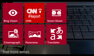
Various Lenses

Sound

I listen to music from my phone all the time. On the train, working on projects, writing this post and even practising my river dance routines. I have invested in a decent pair of earphones from AudioFly and the Lumia 920 gives good output through the wires. I can fiddle with the equaliser settings and switch Dolby stereo sound on and off.
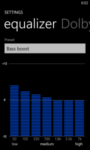
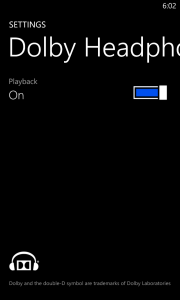
Equalizer Dolby Sounds Settings

The built in speakers are okay, but they are still teeny weeny and you can only expect so much from speakers made for the people of Whoville.

Battery

A bit of a boring subject, but just briefly: Bigger battery (2000 mAh) + bigger HD screen (4.5”) + more things to chew power = still not great battery performance. Oh, and you can’t remove it. So there.

Connectivity

It seems the good folks at Nokia made a checklist of every single mode of connectivity you can possible put in a phone. Short of having a mini Hadron Collider, this device has it all. Wifi in the b,g and n flavours, Bluetooth, NFC, Wireless charging using the QI standard, compatibility with 14 different network frequencies (2G, 2.5G, 3G, 4G) as well as the new Dual Core Snap Dragon processor. Not to mention the most sophisticated camera seen yet (yeah, I kind of like the camera).

But enough about all the delicious, crunchy hardware making up the Lumia 920. Let’s have a look at the software side of things. Nokia has produced a rather impressive suite of software for the Lumia range, in an aim to make their WP8 offering more attractive.

Nokia Maps

The Bing Maps app has been replaced by Nokia Maps, which to a large extent are better than the standard maps. The maps are very fluent and does provide useful information about local businesses, even though it is in no way up to par with Google’s localisation. However, the maps are very useful and seem 100 times more useful than Apples failed attempt at a mapping application (Apple does not acknowledge that Echuca in Victoria exists for example).

Nokia Maps

Nokia Drive

Nokia Drive is the Turn-By-Turn navigation. It does one thing, and one thing very well. It is a fully fledged GPS navigation app, which even has TTS (Text To Speech), which works. My car navigation TTS for some reason can’t pronounce “road”. It comes out as “rod” in this over the top American accent. You would have thought that is one word a GPS should get right, but I digress.

The application is free and comes with downloadable maps from all over the world. So not only can you always have up to date maps, but they are also stored offline, so you can always use your GPS (given it has any battery left, see above).

Nokia Music

Every single platform seems to have their own flavour of iTunes now. There are so many offerings out there you would be excused for not really caring. So what is different? iTunes has music purchases of every song on the planet almost, Xbox music has a monthly subscription, Google Music lets you upload your own catalogue of music to the Cloud and many many more.

Nokia Music is in essence free listening. It comes with radio mixes, which lets you listen to everything from @alexjmackey’s favourite Genesis and Spandau Ballet to the current hits of local and international artists. Now, you can’t choose the exact songs to listen to, but you can select genres from Country and Western to Death Metal. And if there is a particular song or album you like, you have the option to buy it.
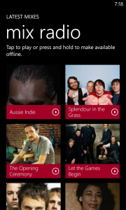
Nokia Music

Because all the music is streamed in the mixes, Nokia has been so kind as to let you download up to four mixes to your phone.

Now, all that is good, but you could ask why Nokia has even bothered to make their own music service? It is a massive undertaking and there are so many services out there as mentioned above.

And I have to mention that Nokia Music is quite buggy. The application decides to stop randomly, it has restarted my phone twice from crashing and even bricked my phone once to the point of a reset (hold down power button and volume down for about 10 seconds).

Nokia City Lens

I first saw this idea in a French research project using Google information on an iPhone. The name of the project eludes me, but the idea of holding up your phone and it presenting an overlay of nearby attractions based on GPS coordinates and compass was mind blowing.

Well, Nokia City Lens is just that. Choose from eight different categories of places nearby, and the app will tell you what is nearby in this category. It works quite well, but the compass seems to be a bit off sometimes. And Dental Surgery came up under “Fun”. Not sure if that is a particular Finnish version of “Fun”. To be honest I haven’t looked up “Fun” in the Finnish dictionary.
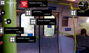
Nokia City Lens

Tapping any of the icons on the screen (which move about a bit due to calibration issues I am assuming), will take you to the location in Nokia Maps and you can get directions. Very impressive app, but to be honest, I am not sure how much I will use it.

Conclusion

I can only hope Microsoft gets traction with this latest iteration of their mobile platform. I truly believe it is a more user friendly and efficient platform than the competition. Taking the whole ecosystem into account with Surface devices, Windows 8 and Xbox, it all just works together. Traditionally Microsoft marketing has been very fragmented and seemingly random, so hopefully this time around it is more successful. As I said in Part 1, I have shown WP7 to two friends deciding on a new handset, and both chose it over iOS, Android and *cough* Blackberry. Not because I told them to or persuaded them, but because they tried them all and chose the best one.

I haven’t touched on other handsets, but all the new WP8 devices are amazing. I had a very hard time choosing, but the outstanding camera and the gorgeous screen on the Nokia made it for me. If you want choice and personalisation in handset and user experience, but without having to be a geek (like me), it is the superior platform. If you don’t want to be a sheep and follow the flock for no other reason than following them, try out a Windows Phone.

I am not looking back.


Windows Phone 8: Show Me Your Live Tiles (Part 1)

Finally! My new Windows Phone 8 phone has arrived. And first things first: it’s yellow. I mean really yellow. Granted I did order it in yellow, but this is smack-in-your-face-safety-vest-neon-super-yellow. I don’t mind actually. As you may have guessed it is the Nokia Lumia 920, and in this geek review I will touch on the handset as well as the new operating system. The first part of the review will wind its way around, through, over and between some of the new bits in the operating system. Part 2 will fondle, caress and make out with the new superstar from Nokia.

[pullquote]My Partner’s 7-year old boy loves Kid’s Corner, as it makes him feel it is his part of the phone. Pretty good trade-off for not sending your boss fart emails.[/pullquote]

I have been a user of the Windows Phone eco system for the past two years and a bit, and in that light I will go over some of the improvement over the past system, that you might not be aware of or have noticed. As was the case with the release of WP7.5 (Mango) in September 2011, WP8 includes a swath of improvements to an already feature rich and mature operating system. Some features are very noticeable, such as the new start screen, and others are buried deep in the belly of the beast, and will probably not be noticed directly. I won’t touch on all the new features and changes, as I do want to do other things for the next week. Instead I will emphasise the areas I feel are important and makes the platform stand out.

When Microsoft announced and indeed launched the new Phone software, the focus was (understandably) on the immediate visual changes and improvements. So that is where I will start.

Start Screen

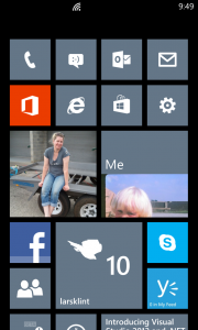
This is without comparison the most reviewed and featured part of the new Windows Phone operating system. It is the face of the new Microsoft Phone attack and the new start screen has been improved and made more “you” (customizable). The first iteration had live tiles showing your latest updates and content at a glance, but all you could do was to move the tiles around. There were some built in apps, like Calendar and Pictures, that were the size of two normal tiles, but that format was not available to third party apps. All that have changed, so app developers now have three formats to choose from.

Start Screen

The screen feels more alive, more personal and more usable. I especially like the smallest tiles for apps that don’t have text content to show on the tile. Something like Phone, Messages, Facebook and Email accounts only update the tile with a number. The small form factor is perfect for that. Other apps really shine from the large landscape tile, and make my Weather Channel app look very impressive. Once developers get their head around the tile sizes, they will become extremely useful and lets the user customise their phone until eternity.

Performance Improvements

A large part of the work on WP8 has gone into the support for all the new shiny hardware. There is now support for multicore processors, high definition screens, a brand new IE10 browser, memory expansions and much more. All of this performance shenanigans means that Windows Phone 8 is even more smooth and slick to use than Windows Phone 7 devices. All transitions, input screens, app loads and interaction in general is extremely responsive and there is no lag that I can find anywhere. It is like everything just works!

Apps load faster, due to the beefed up hardware, and some Apps now exhibit a much better resume behaviour than before. For example, the Facebook app now resumes to the screen you were on, instead of reloading the whole app. Apps stay in memory much much longer, so you don’t have to reload apps every 20 minutes. This means you can now switch between “My Little Pony” and “Rainbow and Butterflies” apps to your heart’s content, just like @alexmackey would do.

Another improvement I have noticed is that the keyboard is vastly improved on two fronts. For one the “Fat Finger” prediction seems more accurate in guessing which word you meant when you typed in “tebieq”. In fact it seems easier to hit the right letters on the keyboard. This might have something to do with the larger screen and the greater pixel density. However, much more exciting is the new predictive typing. In WP7 the keyboard would predict what word you were typing based on character placement and letter sequence, hence it could predict that when you wrote “Wed” you meant “Wednesday”. Not too difficult to implement, and all smartphone platforms has this feature. Now there is predictive sentences, which means WP8 will predict the next word before you have even typed it. For example I can type “I am going to be late” with only eight keystrokes. I haven’t been able to confirm it yet, but the type ahead feature supposedly learn from your typing as well. So it learns which words you put together, so over time it will be much more accurate and useful.

Predictive Text 1 Predictive Text 2 Predictive Text 3

Speaking of the keyboard, Microsoft still haven’t sorted out a feature I loved on my iPhone, being multiple keyboard languages. On my iPhone back in the day, I could switch from English to Danish dictionary with one button click. That meant my text messages in Danish would have the correct spell checking. Still on WP8 I now either switch the language of the phone (not ideal and time consuming) or I teach the phone Danish. Every time a little squiggly red line come up I tap the word and add it to the dictionary. I feel a bit like a primary school teacher teaching the same naughty kid again and again.

Update: Last night I discovered you can download keyboards in a large number of languages, including Danish. Go to Settings -> Keyboard and you can add any of them. They are now available whenever the keyboard is visible, using a little button on the actual keyboard. Woohoo, another awesome addition and I was blaming the wrong kid again.

HD capability

Finally! Hooray, we now have beautiful high definition goodness on the screen. WP8 supports 720×1280 and 768×1280 pixels. On a 4.5 inch display that would mean somewhere in the vicinity of 332dpi. Ha, take that Apple retina display with your puny 326ppi. In other words, Microsoft is finally supporting industry standard screen resolutions.

It means you can record video in 720HD format, but more on the camera in Part 2.

Kid’s Corner

The most surprising, yet simple and useful, feature is Kid’s Corner. Swipe left on the lock screen and a second lock screen (if enabled) is shown.

Kids Corner Lock Screen Kids Corner Home Screen

This is the section where your kid can have their own section on their phone. This means no more access to your phone, no more sending emails to the Buddhist Society saying you want to join, and no more buying of magic unicorns on eBay while you weren’t paying attention. Your offspring can now have their own section they can customise with colours, resize icons and set their own lock screen image and text. As the owner of the phone (and by now probably several unicorns and pictures of cats wearing little Halloween costumes) you decide which apps are in the Kid’s Corner. My Partner’s 7-year old boy loves it, as it makes him feel it is his part of the phone. Pretty good trade-off for not sending your boss fart emails.

Internet Explorer

The browsing experience in WP8 still consists of only Internet Explorer (IE). We are now up to version 10, same as on Windows 8, and the engines behind both the mobile and the desktop browsers are the same. That means you get a faster, more standards compliant browsing experience, but I am still not convinced Microsoft has addressed all of the issues from previous versions. Granted, the browser is much quicker and there are some very nice features, such as customising the toolbar at the bottom and improved JavaScript rendering speed and HTML5 compliance.

 IE 10

I would like to see what Mozilla or Google could bring to the platform as well. If anything it would push Microsoft to improve IE to stay on top.

Enterprise Apps

The direction that Apple, Microsoft and to a lesser extent Google has taken with third party development, means that programs are certified by the corporation and published through the single channel. Back in the days of Wild West programming, every man and his dog (or duck even) could publish a program and sell and deploy it, on a platform like Windows Mobile. No problem. What that lead to, was a mess of different user interfaces, broken programs, general discontent and frustration. It did work occasionally, but there were a lot of problems. To fix this, the big corporations, starting with Apple, took control and dictated how applications and programs (or “apps”) were to look, feel and smell. Not only did the quality of apps improve, but it also proved to be a very generous income stream.

If you are in the development space, especially consulting, you might see a problem with this approach. Stores for purchasing apps are public. You publish one app, you can restrict by market or region, but essentially your grandma will have access to the new Magic Polar Bear Recognition app you made. Or even worse, an intranet application for a large corporation. There was no way to create private apps for a closed audience.

Apples approach was an Enterprise App Store, which allows companies to limit their attached handsets to a particular set of apps, be those public or not.

Microsoft is now introducing the Company Hub application which is similar to side loading apps in Windows 8, and without much of the hassle that was needed to accomplish the same in WP7. A Company Hub can be managed by the IT department in a company and allows full control and integration with Office and management via remote management features. If this is successfully implemented, it might just get Microsoft back in the door for mobility, with a lot of major corporations.

About time

A couple of little things have been annoying me by their pure absence. But lo and behold you can now take screenshots. Yes @sbarski, you can take a picture of your favourite cake recipe on the screen and email it, post it to Facebook or send it via MMS to your fan club. Press the Home button at the same time as the power button and Bob is your uncle (or you can get a picture of him at least).

I have also been trying to figure out why there was no pinching action on the camera when operating it. It seemed like such a natural thing to do, but Windows Phone was not having a bar of it. Until now.

 Go Go Go

I love Windows Phone. Everyone around me will tell you I am a Microsoftee and I have seen several of my friends switch to Windows Phone and never look back. In my mind it is by far the best mobile platform when it comes to usability, personalisation, development experience and looks. There is nothing else like it.
My hope is that Microsoft Marketing can create a campaign that does the phone justice. A large problem I think is that retailers are not educated in showing off the devices, so people naturally gravitates to what their friends have. When it comes down to it, the general public don’t have an interest in which company creates their mobile experience. They buy the phone the guy next to them has. Unless someone can show them the different platforms and pros and cons of each, they aren’t going to change their ways.


A shift in approach from Apple?

These are exciting times indeed. Over the last year or two we have seen the largest shift in personal computing since Apple introduced the Mac in 1984 and Microsoft introduced Windows for the PC in 1985. It was these product innovations that started the era of modern computing as we know it today. These products filled a need and solved an inherent problem with computing at the time. How do we put computers into the hands of the average person with no computer knowledge? Although the approach from the two companies were somewhat different (Microsoft evolved their existing product MS-DOS for hardware manufacturers, and Apple designed and sold a complete hardware and software package), they both essentially targeted the same end user. Believe it or not, the companies actually worked together on a number of software applications and licensed features to each other. The rest is more well-known history and both companies’ successes are well documented and both Steve Jobs and Bill Gates are names the average person is familiar with.

Now we are seeing the biggest shift in personal computing since those days. It started with the launch of the iPhone in June 2007. This single device redefined the way we use and think of mobile phones. The introduction of the HTC Dream running Android in 2008 and the Windows Phone 7 devices in October 2010 further fuelled the shift in devices from stationary to mobile. Computing was in some extend made available on the move. Mobile data usage has steadily more than doubled every year since 2007 and in 2011 there was an almost threefold increase. And the growth is across all markets and show no sign of slowing down. The top 20% of mobile data users now consume almost 1 GB per month. Read the whole Cisco report when you have a spare 3 hours.

Now, I am sure you didn’t come along for his ride for a history lesson, so I will move on to the main focus of this article. Tablets. They are a form factor that has been very hard to nail. Microsoft introduced the first fully fledged tablet computers over a decade ago in 2000. Safe to say they never took off, being cumbersome and not designed for handheld computing. It wasn’t until Apple’s iPad was introduced in April of 2010 that the general consumer opened their eyes for the tablet devices. You can argue that consumers didn’t necessarily need the device, but it looked beautiful and Apple has always been perfect in their marketing strategy. A large range of Android powered tablets have followed and now Microsoft have finally launched their Surface device. Apple has sold over 100 million iPads and still control the majority of the market. But things are heating up to win the mobile consumer. And then Apple introduced the iPad mini.

Here is a somewhat controversial statement: Is Apple turning into a follower rather than a leader? I know you think I am going bonkers, but stay with me. When Steve Jobs was leading the world’s largest tech company, the focus was 100% on innovation, design and pushing the boundaries. Now that Jobs sadly has gone to the iCloud and Tim Cook has taken over, there seems to be a shift in direction. With the latest product launch of the mini iPad, Apple is no longer leading the industry, but playing catch up with competitors. There is already a large range of mid-sized tablet devices on the market, and it is questionable what the mini version of the popular iPad brings to the market. Granted the iPad mini is in fact 7.9 inches of screen real estate, but it is still in the same segment.

The first 7 inch devices bearing the Android flag came to market in early 2010, with Samsung leading the way. Apple’s iPad put the tablet on the consumer’s mind, but other companies succeeded in the small tablet space. So why is Apple bringing out a mini iPad now? It does seem like it is a move to not lose market share and to fill a gap in their product line, and that is absolutely fine. But it is not innovate and ground breaking.

Speaking of mid-sized tablets, Microsoft is now rumoured to be developing a 7 inch tablet as well, based around their new Surface device. According to several media sources it will be an Xbox gaming tablet and will be focused primarily on gaming. At least that is a different take on the tablet space, and I am keen to see what they come up with.

And while we are at the topic, let us now forget Amazon. The online retailing behemoth launched their own tablet, the Kindle Fire, with some success. As of 31 August 2012 they have sold an estimated 5 million device only in North America, which equates to about 22% market share. The device is priced very aggressively and Amazon intends to drive business to their website via the device.

This space is only going to get more and more interesting and competitive as the desktop PC experience seems to be shifting to mobile and handheld. Apple is the unequalled market leader at the moment, but many other players like Amazon, Microsoft and Samsung are looking to steal some of that business. Microsoft has just launched their Surface tablet device, and Amazon is coming out with the Kindle Fire HD. And as always when the big players get it right, the market will be flooded with cheap budget copies. I am very excited in this shift in personal computing, and as a software developer (geek actually) this presents a whole new range of opportunities. And as an end user of the products this development can only be a good thing. Cheaper devices with more and more functionality.


Windows Phone 8 – Near Field Communication and Why You Should Care

Yesterday Nokia and Microsoft announced the next generation Lumia phones. That in itself is exciting for a geek like me, and there are a range of new features which could entice even the most sceptical consumer mind. The new PureView technology leaves most cameras behind and the wireless charger is just an awesome party trick (look mum, no hands!).

The most interesting feature revealed, if you look at future uses and applications was the implementation of the Near Field Communication (NFC) technology. NFC has been around since 2004 in an organised format, when some big players including Nokia and Sony set up the NFC Forum to advance the use of the technology. So what is NFC?

According to the official NFC Forum

Near Field Communication (NFC) technology makes life easier and more convenient for consumers around the world by making it simpler to make transactions, exchange digital content, and connect electronic devices with a touch.

It is in essence a short range wireless signal that allows a simple touch with the device to transfer data. By short range we’re talking about something like 1.5cm, or half an inch. Not much at all. So why is this so cool? Because of the very short range of the signal, as well as part of the protocol, it is inherently secure. All it requires from the user to use it, is a simple touch with the device. And this touch enables a data transfer to happen instantly.

If you are still sceptical, let me exemplify it for you, so there is no doubt left. Here are 6 areas I can think of off the top of my head.

1. Payments

Google has already introduced their Wallet technology and Microsoft is now launching the technology as part of Windows 8 and Windows Phone 8. Imagine if you could store your credit card data, your loyalty card data, or even coupons and special discounts applicable only to a select group of people. Mastercard and Visa are already members of NFC Forum, and NFC enabled phones could use the infrastructure already built for the current tap-and-go technologies PayPass and PayWave. Because of the short range and inherent security of the technology, this would be a great match.

For retailers and marketing agencies, this is a major step forward too. They can suddenly see when certain consumers have purchased a particular item, and can accordingly target them. German digital coupon company Coupies is one of the first companies to embrace the technology and taking it to the consumer.

2. Public Transport

I live in Melbourne in Australia. Over the last few years, the state government has introduced the infamous Myki system as a replacement for the ageing public transport payment system. So far it has costed the Victorian tax payer around $AUD 1.5B (yes, that is billions!) and the costs just keep on coming. That means a ticketing system for a single city has now cost about as much as the latest Mars rover. It just doesn’t make sense. If NFC technology had been used instead of the proprietary Myki card, commuters could have used a number of devices including their mobile phone as a payment option, and they wouldn’t have had to “Stop-Hold” (and often change reader) to go through the payment gate.

3. Health Care

Doctors and nurses could scan tags on beds with information about treatment, medication and much more. This would allow a full history of which medical professional has seen to the patient and what treatment they have given them.

Another application could be to help physically disabled people to ring their friends, by touching a picture of them with their phone, as developed and researched by University of Ljubljana all the way back in 2009.

4. Device Pairing

Imagine taking a photo with your mobile phone, and then to print it out, all you have to do is touch the printer with your phone. Or pairing Bluetooth devices with a single touch. Touching two devices together could enable file transfers or team gaming. No more driver hell of finding the right driver, then downloading and installing it manually.

5. Social Media

A German company called FriendTicker developed a system of physical tags in locations, where the user could touch a tag to check in. Or you can touch to devices together to say that you are at Jimmy’s Pub with this particular person. This could allow instant product promotions to consumers by sending them coupons, product offers and promotional material for a particular location.

6. Information Retrieval/Implicit Search

NFC tags could be placed in all sorts of locations. In a museum to allow visitors to touch and bring up information on a particular piece. On consumer items to build up an in-store wish list. Or how about on your suit case to work as your virtual travel agent. That is exactly what tag-a-bag won the 2012 NFC Best Innovative Solution for.

The NFC technology has a real potential to change our lives in so many small and not-so-small ways. And the fact that Nokia is now putting the technology in their latest devices indicates there will be a real push for the technology in the future. But until the technology has been made more “sexy” it will be a while before mainstream consumers, and not just us geeks, picks up on the infinite possibilities it provides. Watch this space is all I can say. Big things are about to happen.


How to Create Your Own Custom URL Shortener Service Using YOURLS

I am expecting you might have noticed the short URLs that are being used more and more frequently on Twitter, Facebook, Google and many more places. They look something like this http://goo.gl/maps/lPr5V  and are a way of limiting the size of your website links. There are a handful that are widely used, such as bit.ly, t.co and goo.gl.

I needed to use URL shorteners to tweet my blog posts, and it occurred to me that it would awesome if I could use my own domain klint.co. It is short, descriptive and I own it (as much as you can own a non-physical conceptual digital asset). Furthermore, I want to drive traffic to my site anyway, so why give that traffic to a third party?

I did some initial googling and binging to come up with the tool/library YOURLS. It is a very basic implementation using a database, redirect and some smarts to generate a short unique URL that maps to a normal URL.

And what is even better is that there is a complete WordPress plugin designed to allow you to combine your Twitter account with YOURLS. So far so good.

To set it all up follow these steps:

  1. Download and install YOURLS
  2. Follow the setup instructions
  3. If you are using WordPress install the YOURLS: WordPress to Twitterplugin.
    1. To configure it follow these steps (see what I did there?)
    2. If you have trouble authenticating your Twitter account with the plugin, try and disable all your Twitter related plugins. I had a conflict with one.
    3. You should be able to post to Twitter directly from your posts now.

In addition you can now log into the YOURLS admin panel, which lives at http://yourdomain/YOURLSdir/admin. From here you can create bookmarks to quickly create short URLs for whatever site you are on. This is handy for creating links on the fly which can be used on other sites, to then redirect traffic through your domain.

YOURLS also has the ability to act as an API, so other applications can interact with it and implicitly create short URLs for your domain. You set up a signature token in the YOURLS admin section and use that to authorize 3rd party applications to use YOURLS on your domain. If you are using the Chrome browser, the extension Template can make use of your custom URL shortener.

YOURLS is a great tool, and it is relatively easy to set up and integrate into your various sites, applications and tools. Have you used it? Any problems/caveats? Let me know in the comments below.